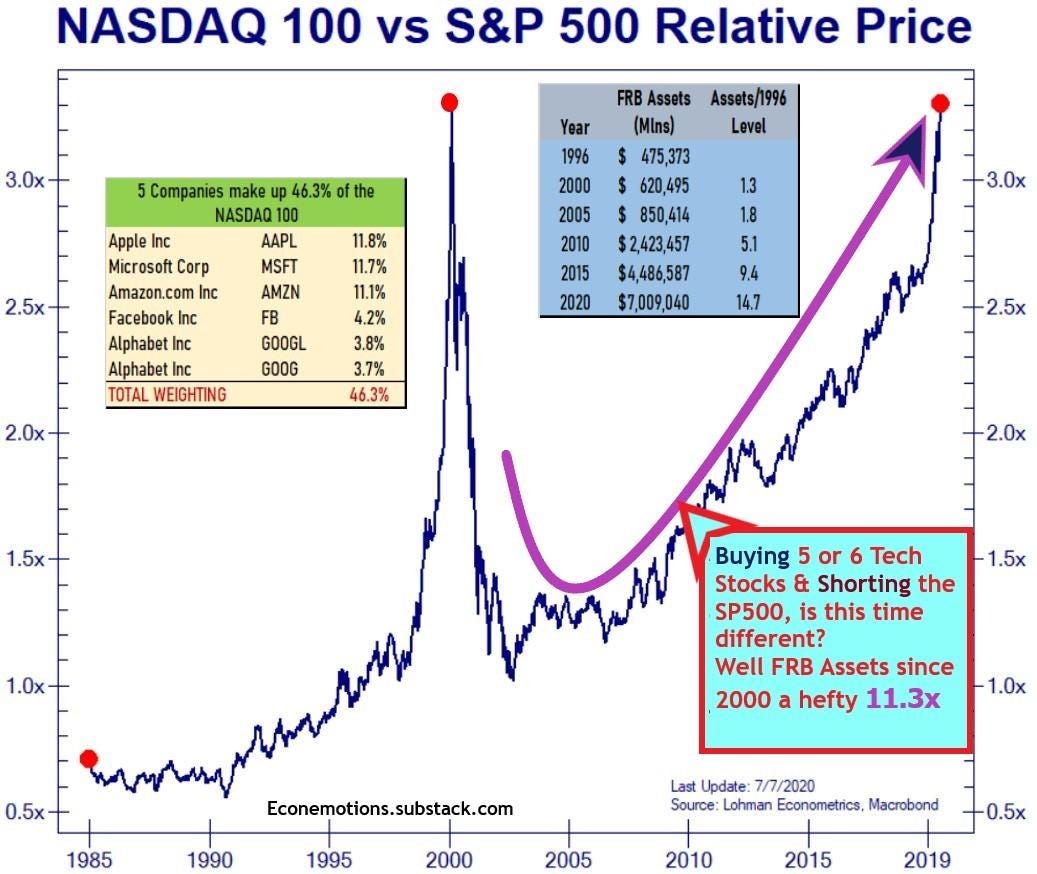
I've been seeing this Nasdaq vs SP500 relative value comparison comparing the 2000 top vs now. Is this time different? Well we point out a few things and we would love your comments.
Magnelibra's belief is that mean reversion tends to only happen after things blow out so far that it takes a few out the door feet first. Now its been quite obvious where all the money is going, its the FAANGMs and we know the hedge is the SPY and this chart confirms that.
Yet with QE, with the FED with all the global central banks pouring money into these techs, well then it shouldn't come to anyone one's surprise of the NQ outperformance.
Also we must realize that the FRB Balance sheet assets are up a whopping 11.3x since 2000.
#equities#money#nasdaq#SP500