
Tracker Update FOMC Begins
Bitcoin chart

The Flash PMI data yesterday saw manufacturing up tick a bit to 49.0 expecting 46.3 but the more important Services data continues to fall and this is what has been the driver of inflation over the last year so the FOMC should welcome this data as it fell to 52.4 from an expectation of 54.1. Many use the 50 marker as expansionary or contraction, however the trend is obvious:
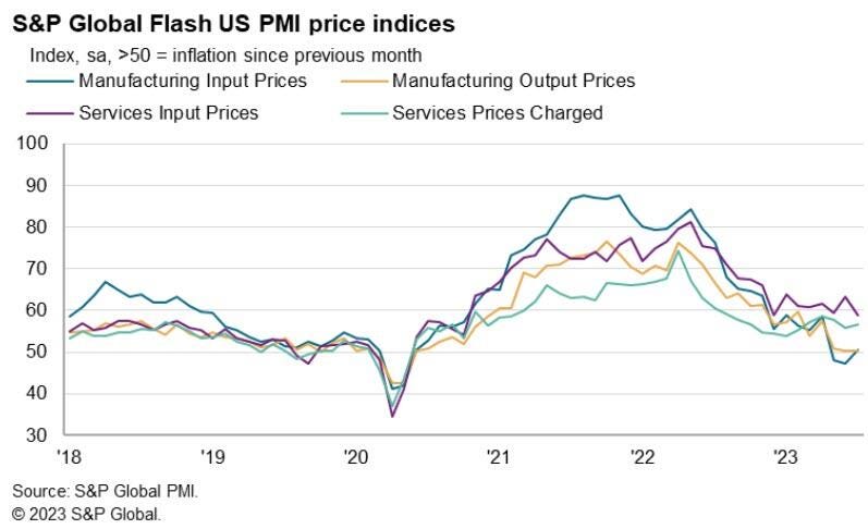
Now keep in mind this very important factor, that since 2020 the FRBs balance sheet has expanded its assets (high powered base money) by a massive from $4.2T to as high as $8.9T (currently $8.3T) or more than double. This is massive stimulus, yet we continue to see Flash PMI Services trending toward that 50 area. This is why we cannot focus on individual monthly reports, but must take this data and see which way it is trending. The FOMC hiking into this kind of trend is a recipe for a hard landing!
We also saw this chart yesterday from TwiXter by @RobinBrooksIIF showing the absolute disastrous C&I loan growth this year:
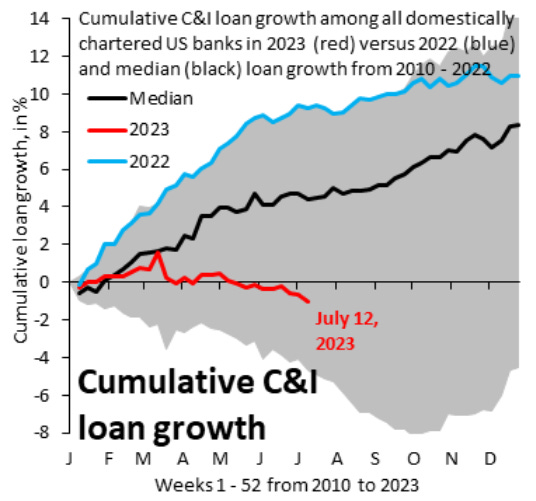
So the macro data is abysmal, we know it, the FRB knows it and this is why we believe the only reason to hike is to continue to subsidize the banks but this cure is also the killer, so its a very fine line and one by which the FRB is going to hang the overall economy on, not a great plan by any means…
It is good to see Zerohedge on board with our RRP analysis and we knew things would get sticky as we got near the $1.7T Reverse Repo Program level (Magnelibra’s proprietary max liquidity threshold)…the low was actualy $1.716T and it marked the absolute high in the stock market for now.
Its funny how something Magnelibra has been talking about for months as the source of liquidity is now on Zerohedge, but that is why we present our analysis to you, to stay ahead of the game. The two blue lines are the focus here, the Teal is the RRP Balance and the Blue is US Equity Market Cap. As market caps peaked so too did the drop off in RRPs, The market cap hit $49T and the RRPs hit $1.716T so if the RRPs rise again, which they are this means spec money is going back to the RRP program earning 5.05% (Risk Off). The scales on the chart for RRP and Market Cap are inverse (the higher the market cap, the lower the RRP balance)
This is how we see it and this Zerohedge chart does a nice job capturing this:

