Why "Expensive" Doesn't Mean What It Used To
A 5-Year Baseline for the S&P 500 and Nasdaq.

Turn on any financial channel and you will hear some version of the same warning. Stocks are expensive. Valuations are stretched. The forward price-to-earnings ratio on the S&P 500 is running around 20 times, well above the long-run average of 15. Prudence, we are told, requires caution.
Even we noted an even greater dislocation between valuations and we took a lot of hate on LinkedIn and elsewhere for the analysis when we posted it on July 26th. Here is a link to our post and research, The Valuation Illusion: What a Debased Dollar Hides
We do not disagree that valuations are elevated by conventional measures. What we disagree with is the assumption that conventional measures still capture and do so in a static and less dynamic fashion which basically sterilizes their efficacy. What we want to do with today’s post is try to estimate given what we understand about the inputs that go into generating nominal asset prices and extrapolate our data and calculate what might actually transpire in regards to the price of an S&P 500 share over the next five years. This post walks through why, and what the arithmetic actually implies.
The reasoning follows five steps.
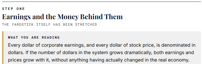
Start with a simple observation. Consider what has happened to the Federal Reserve’s balance sheet since 1998. At the end of 1998, the Fed held about $546 billion in assets. As of July 2026, it holds roughly $6.74 trillion. That is a 12-fold expansion in a bit over 27 years, or a compound annual growth rate of about 9.4%. Something we here at Magnelibra often point towards!
Corporate earnings did not grow in a vacuum during that same period. Much of the earnings expansion happened in dollars whose supply was being multiplied at 9.4% per year. When you look at a chart showing that “earnings have doubled” over some period, part of that doubling reflects real productivity and real economic growth. Part of it reflects the fact that the yardstick itself has been stretched.
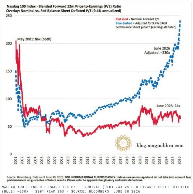
If you apply a simple deflator, dividing today’s forward earnings by the cumulative expansion of the monetary base, the S&P 500’s forward price-to-earnings ratio does not sit at 20. It sits closer to 240. When measured against a stable monetary base, the market is not modestly expensive. It is extraordinarily expensive. (As our Nasdaq chart above pointed towards)
This is not a trick or a gotcha. It is an honest observation about which yardstick you use. The conventional 20 times number is correct if you accept the current-dollar denominator as fair. The deflator-adjusted 240 times number is what the conventional number would look like if the underlying money supply had held stable.
Both are true. They just measure different things.
The second force is easier to miss because it looks like a fiscal number rather than a market number. But it feeds directly into equity demand.
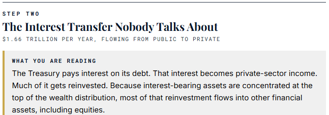
The United States currently carries roughly $39.5 trillion of total public debt. (as of July 2026) The Federal Reserve’s policy rate sits in a range of 3.50% to 3.75%. The average effective interest rate on the outstanding debt stock, blending short and long maturities, is running around 4.2%. Simple multiplication: 4.2% of $39.5 trillion is roughly $1.66 trillion per year in interest payments.
That $1.66 trillion does not disappear. It flows from the Treasury to the holders of Treasury securities. Some of that goes to foreign central banks and pension funds. A significant portion goes to domestic investors, banks, insurance companies, and individual holders of government debt. It becomes their income.
What do the recipients of that income do with it? Some of it funds current consumption. Much of it gets reinvested. And because the ownership of interest-bearing assets is heavily concentrated at the upper end of the wealth distribution, most of the reinvestment happens in other financial assets, including equities.
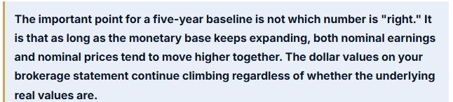
This creates a self-reinforcing loop. The government issues more debt to fund deficits. The debt pays interest. The interest becomes private-sector income. The private sector reinvests it, in part, into stocks. The demand supports equity prices. Rising equity prices increase the wealth of holders. Increased wealth funds continued demand.
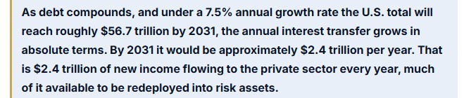
This is not speculation. This is arithmetic. As long as the debt grows and the rate is positive, the annual transfer grows.
The third force is the most under-discussed and probably the most important for understanding why elevated valuations persist rather than mean-revert.
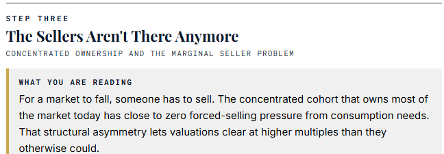
For a stock market to fall, someone has to sell. Prices adjust when supply outweighs demand. In every market crash and every prolonged bear market, forced selling by holders who needed the money for something else played a central role. Retirees drawing down portfolios during retirement. Homeowners liquidating to cover mortgages. Families selling to pay medical bills. Investors who bought on margin getting margin calls.
Now consider the ownership structure of American equities today. The top 1% of households own approximately 50% of all corporate equities and mutual fund shares. The top 10% own around 87%. Stocks now represent about 33% of total household wealth, a record share.
Combine that with something else. The top 1% starts around $11 to $14 million in net worth. The top 5% starts around $3 to $4 million. Average net worth in the top 1% is many multiples above the threshold. These households do not sell stocks to fund groceries, mortgages, or vacations. They have labor income, business cash flow, dividends, and interest that cover living expenses even at a very high standard. Their stock holdings are not a liquidity source. They are an accumulation vehicle.

This means the marginal seller in a broad-market decline is no longer the average American. It is a small subset of leveraged holders or forced institutional sellers. The remaining ~90% of the market’s equity value is held by hands that do not need to move it.
In a market with sticky ownership, valuations can clear at higher multiples than they could when ownership was more diffuse. This is not because the math of discounting future cash flows has changed. It is because fewer people are calculating that math in the first place. The dominant holders are not selling based on multiple compression. They are not selling based on much of anything.
Assumptions:
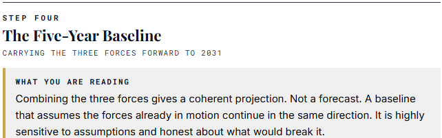
U.S. total debt grows at 7.5% per year (recent trajectory extended). The Fed keeps its balance sheet roughly stable or slightly expanding to keep reserves ample as debt issuance rises. The average effective interest rate on the debt stock stays near 4.2%. The concentrated ownership base continues to accumulate rather than sell. The S&P 500 grows at 9% nominal per year. The Nasdaq Composite grows at 11% nominal per year, higher because it is more sensitive to liquidity and growth narratives.
Where these numbers come from: the 9% figure for the S&P 500 is roughly the sum of a 5% earnings yield (the inverse of a 20 times P/E) plus about 4% nominal earnings growth. The 11% figure for the Nasdaq reflects its historical premium to the broader market driven by its tech-heavy composition. The 7.5% debt growth blends recent realized growth of about 9% with a modest slowdown as interest costs and political pressure impose some brake.
No don’t misunderstand things, this is a baseline, if the FOMC gets crazy, starts cutting rates or raising rates aggressively this changes the trajectories. We do not think they will do anything of the sort either way. Status quo rather is their goal! We discuss this further in Step 5.
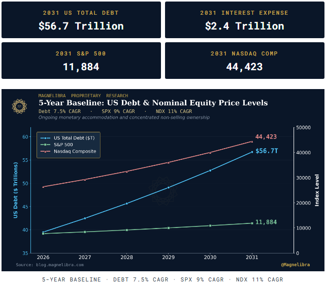
Today (early August 2026) the S&P 500 sits near 7,724 and the Nasdaq Composite sits near 26,363. The baseline projects roughly 54% cumulative appreciation for the S&P 500 and roughly 69% for the Nasdaq over 5 years. In annualized terms, 9% and 11% respectively. Neither number is extraordinary by the standards of the last 15 years.
First, a genuine return to aggressive quantitative tightening. If the Fed decides to shrink its balance sheet meaningfully rather than accommodate rising Treasury issuance, the monetary base contracts relative to nominal activity. Multiples compress. Prices fall. This is possible in principle. It is politically difficult in practice because it worsens the interest cost problem for the Treasury and creates funding stress in short-term markets.
Second, a sustained rise in real interest rates. If inflation-adjusted yields climb above roughly 3%, the mathematics of equity valuation compresses because future cash flows are discounted more heavily. Private credit deleverages. The base’s leverage multiplier declines. This is a bigger risk than it appears because it does not require a policy decision. It can happen through market forces if the term premium expands sharply.
Third, a recession or major earnings disappointment. Even under the monetary framework, actual earnings matter for the specific number the market clears at. A cyclical downturn that cuts earnings 20 to 30% would compress prices even if the monetary backdrop remained supportive. Cutting rates aggressively sends the markets bearish overall signals and results in downward pressure as investors reduce exposure and raise cash.
Fourth, political mandate for fiscal consolidation. A sustained voter preference for smaller deficits, higher taxes, or genuinely tighter money would rewrite the arithmetic on debt growth and interest transfers. History suggests this is rare and short-lived, but it is not impossible.
If you are a construction worker who has watched materials, labor rates, and home prices all rise together over the past twenty years, you already understand this intuitively. The number of dollars you touch each week has gone up. So has what they cost you.
If you are a surgeon who has watched your practice’s revenue rise while your real purchasing power on major purchases has stayed roughly flat, you understand it from the other side.
Both experiences are the same phenomenon. The practical implication is straightforward. Under this framework, the mistake is not being long. The mistake is holding cash and watching it dilute against a currency base that is growing at 5 to 9% per year while your bank pays you 2%.
For those willing to accept volatility, three assets fit the framework naturally:
The S&P 500 captures broad participation in the corporate sector that benefits directly from the monetary expansion, the interest transfer, and the concentrated ownership dynamic.
The Nasdaq Composite provides a higher-beta expression of the same forces, more sensitive to liquidity and growth narratives.
Gold hedges the monetary excess itself. It historically performs well during periods of sustained central-bank expansion and rising public debt, precisely because it is a non-liability monetary asset. Central banks themselves have been net buyers for years, adding structural demand.


None of the above is a prediction of easy returns. The valuations at the starting point are elevated by every conventional measure. That means the margin of safety is thinner than in prior decades. Drawdowns of 20 to 40% remain possible along the way and would be painful even for holders convinced of the long-term thesis.
The 5-year baseline is stylized. Actual paths will not follow smooth compound curves. There will be volatility, recessions, geopolitical shocks, and periods of significant underperformance. What the baseline captures is the directional bias created by the forces in place, not the specific timing of any particular year’s return.
This is also not personalized investment advice. Individual circumstances vary. Someone with a 5-year window before major expenses has different considerations than someone with a 30-year window. Someone with debt has different considerations than someone with cash reserves.
The point of the exercise is not to tell you what to do. It is to explain, in plain terms, why the "stocks are expensive" argument that has kept careful investors on the sidelines for the last fifteen years has been consistently wrong, and why it is likely to remain wrong for as long as the underlying monetary architecture remains in place.
Expensive against what? That is the question the conventional analysis never answers. When the yardstick itself is being stretched, prices measured in that yardstick climbing is not exuberance. It is arithmetic.
We thank you for reading our work, please think about supporting our work by subscribing and it costs you nothing to hit the like button or to share it. We believe we provide unique insights that others seemingly miss.